I have a love for words and a knack for SEO – and as a mama, I know just how challenging it can be to run a business while raising a family. This blog is just one of the many resources you’ll find here that’ll help you boost your online visibility without sacrificing your sanity.
Thanks for being here (and I hope you’ll stick around).
Mckayla
categories
blogging
seo
Business
free seo checklist
get your checklist
explore
case studies
to the shop
work with us
follow us on instagram
share
Get access to six simple things you can do in 15-minutes or less to improve your SEO and get your website (and content) to show up in search.
In an email sent out on August 1st of 2022, Flodesk announced they were welcoming Beta Testers and current Flodesk members to try out their newest feature: Flodesk Checkout. Flodesk Checkout is their solution to make your systems as a business owner simplified and in one place while staying affordable. At the same price as Flodesk’s original email marketing program – $38 before saving 50% using a partner code – it’s hard to see if this solution will truly be what they claim.
The only way to know is to try, so for now, we’re going to simply break down what’s included in this new set-up and how Flodesk Checkout works. Just a reminder that Flodesk Checkout is still in Beta and is not widely available, yet.
How Does Flodesk Checkout Work?
The checkout feature from Flodesk works by creating a landing page for your product or off (they provide three options that best suit your purpose), adding a checkout, and finalizing with an end “result” for your shopper or client. The form builder seems to work exactly like the Flodesk email builder and form builder of their original email marketing program.
Let’s walk through the process:
#1. Navigate to Your Checkouts
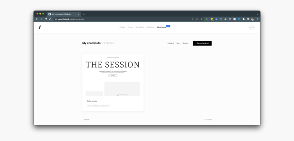
Similar to how you navigate to the other aspects of your Flodesk account, your Checkouts are held in a separate tab. Not only can you easily view and rename your checkout pages in “My checkouts” but you are also able to organize via folders.
While this view is great, I do feel as though users with multiple products or checkouts will find it cluttering in the end – even with the option to organize in folders. As a service provider who offers multiple digital products myself, this setup is okay. I prefer the set-up of my ThriveCart list view in comparison.
#2. Design Your Landing Page
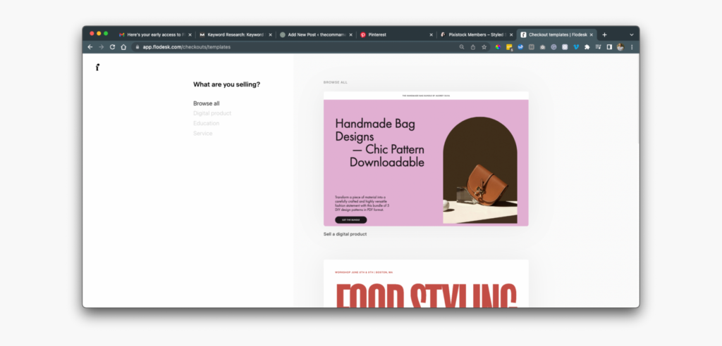
When you’re ready to create your first checkout page, follow the same actions you would for emails or forms but in the checkout area. You’ll be directed to a page that conveniently asks “What are you selling?” – based on your response or choice in the left column, you’ll be directed to templates best suited for your needs.
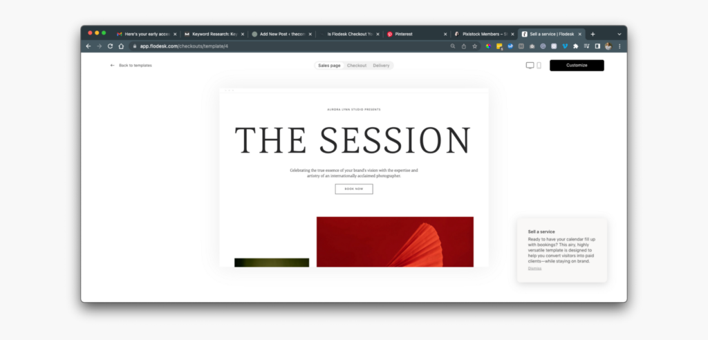
For the purpose of this Flodesk Checkout mini-tutorial, we’re going to choose the “service” option. While the template works fine – and looks fine – on its own, it’s not my personal brand style. It’s in a very trendy service provider style that is popular at the moment, which works in favor of Flodesk’s audience.
Like it’s predecessor, Flodesk forms, Flodesk Checkout can be customized to match your branding and personal or brand style through the use of text blocks, layouts, and graphics.
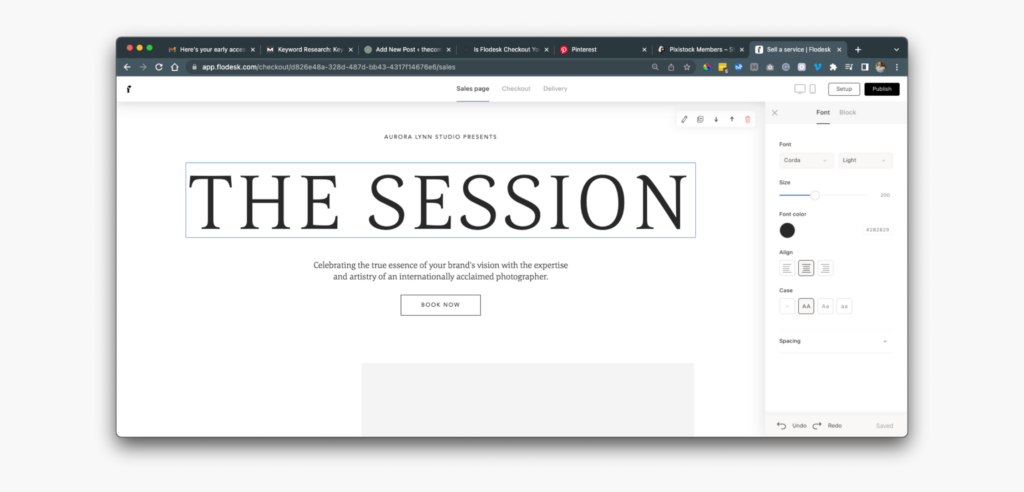
After playing around with the platform, it’s pretty user-friendly. As a Flodesk user of 3+ years, this style of editing is familiar to me so I have an advantage. I do believe there would be a learning curve for users that are not as familiar with the original features – although nothing above what any other checkout system requires.
#3. Creating Your Checkout
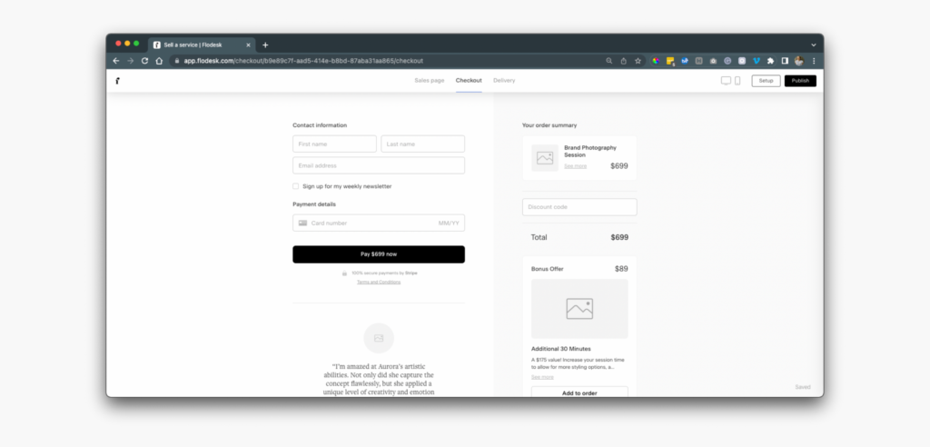
This is my favorite part of the Flodesk Checkout set-up. It feels and looks cleaner than the ThriveCart system that I’m used to and allow more customization than operating directly through stripe for invoicing/checkout creation.
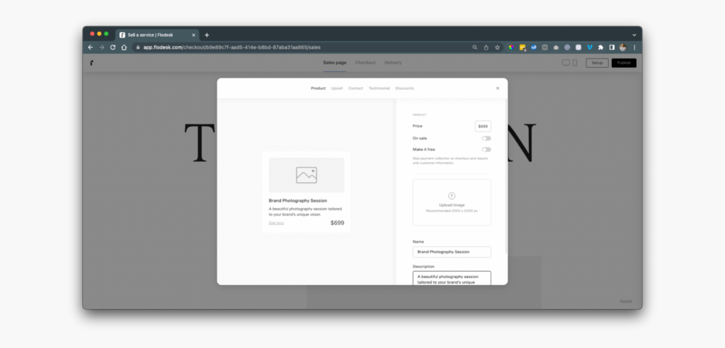
I appreciate the ability to add a bonus offer in a clear way – which is removable if you don’t plan to offer a bonus offer – along with a section for a testimonial. You can easily edit the sections, colors, and text by clicking the desired area and altering in the right-side column.
This is also the section where you create your product settings – such as name, offers, discounts, and price.
#4. Product Delivery
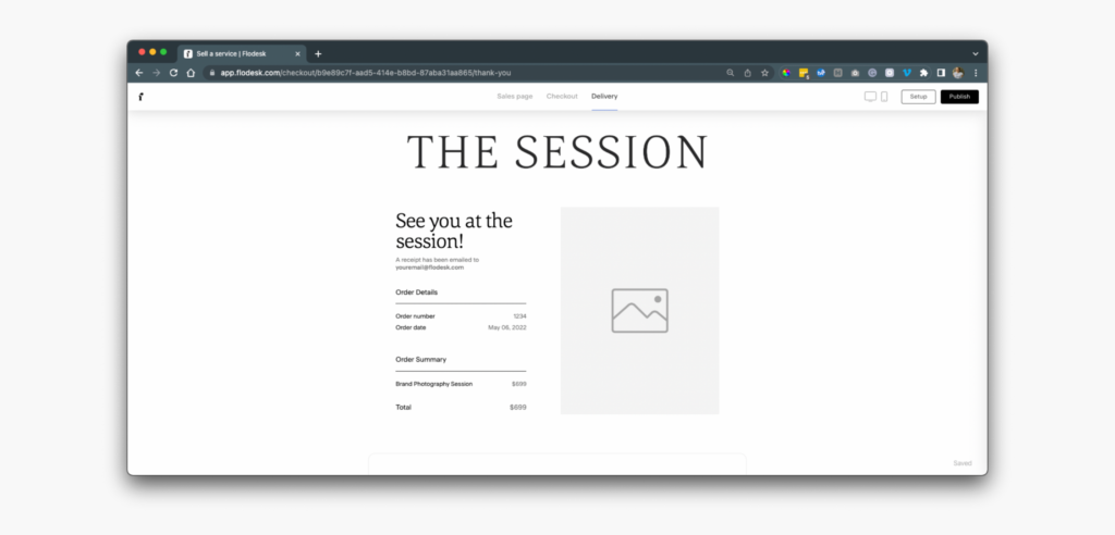
Much longer than what you can see above, the delivery section of building your checkout provides a short receipt (as seen) and options for downloading guides, scheduling your call, and watching a video. You’ll be able to clearly customize and guide your client or shopper to their next step – something that is great for building trust and establishing yourself as the expert.
#5. Link Your Stripe Account
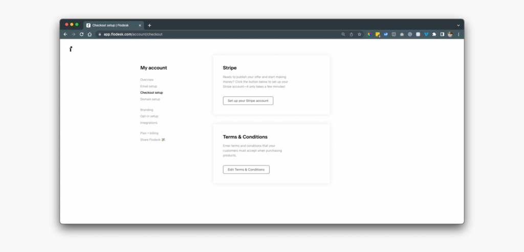
Last, but not least, to actually start selling you’ll need to link your Stripe account in settings! You’ll follow very similar steps as you would for linking Stripe to other platforms – nothing crazy here. While you’re in your settings, you’re also able to create and edit your Terms & Conditions that shoppers/clients will see when purchasing through your Flodesk Checkout page.
Is Flodesk Checkout the Key to Higher Conversions?
It very well could be for solopreneurs, service providers, and business owners that do not have the ability to invest in full-scale tripwires built by professionals – a service that can range from hundreds to thousands depending on the extent of your project. Flodesk is offering this ability for service providers to easily DIY their systems in a way that clearly communicates their offers while remaining aesthetically pleasing.
It’s also a great solution for selling digital products that you might not need to create a new sales page (or want) to create a new sales page for on your website – instead, it can be fully hosted and delivered in Flodesk.
While the system is still in development, I do see tons of opportunity for Flodesk to branch out and connect workflows, tripwires, and more based on your customer actions. I think this is a simple version of what they have planned and that it has the possibility to truly alter your conversion rates for the better – especially at the price. Big name programs are costly and not suitable for service providers that are possibly in months of slow cash flow or just starting out.
What Are the Downsides of Flodesk Checkout?

I don’t want to give a huge negative review on some aspects of Flodesk Checkout simply because they are in their Beta stage and can easily grow in the future. Still, my overall view is not all sunshine and rainbows.
I’m worried about the SEO capabilities of these new landing pages and the lack of ability for Pinterest – a platform that prefers content from your site aka your domain – and Google, another platform that prefers content on your site. Long-term conversions and sales rely on the ability to maintain long-term traffic vs. short-term periods of marketing.
There’s also the lack of ability to welcome affiliates – a known method of growing your reach and expanding your sales. I feel like this would be an amazing feature in the future thanks to your email list being hosted in the same area, hopefully, this could lead to an even easier affiliate process and the ability to track sales (since it’s all in one space).
Overall, I look forward to utilizing this new feature and seeing if it makes sense to swap my products over – or if ThriveCart remains the better option for my small service-based business.
Reader Etiquette
© - Content and images in this blog are copyright this blog unless stated otherwise. Feel free to repost or share images for non-commercial purpose, but please make sure to link back to this website and its original post.
℗ - We do not store any information about your visit to our website other than for analytics and optimization for content and reading experience through the use of cookies.
c/o - Our site does at times contain paid advertisements, sponsored content, and/or affiliate links.
You might want to check these out too while you're at it
categories
blogging
SEO
business
It's me, hi! Your SEO bestie.
get to know me
work with us
//
services
//
case studies
//
Mom of three, lover of all things blogging, and borderline obsessive coffee drinker — I also just happen to love making complicated things simple and accessible, especially when it comes to SEO. The blog is a collection of what I've learned from years of testing, trial and error, and working with amazing clients with impactful businesses (just like yours). Blogging and SEO doesn't have to be boring — and it definitely doesn't need to be difficult.
Mckayla
get your checklist
Want to improve your website SEO in one afternoon? This free resource offers 6 actionable steps you can take in 15 minutes or less to instantly improve your SEO.


